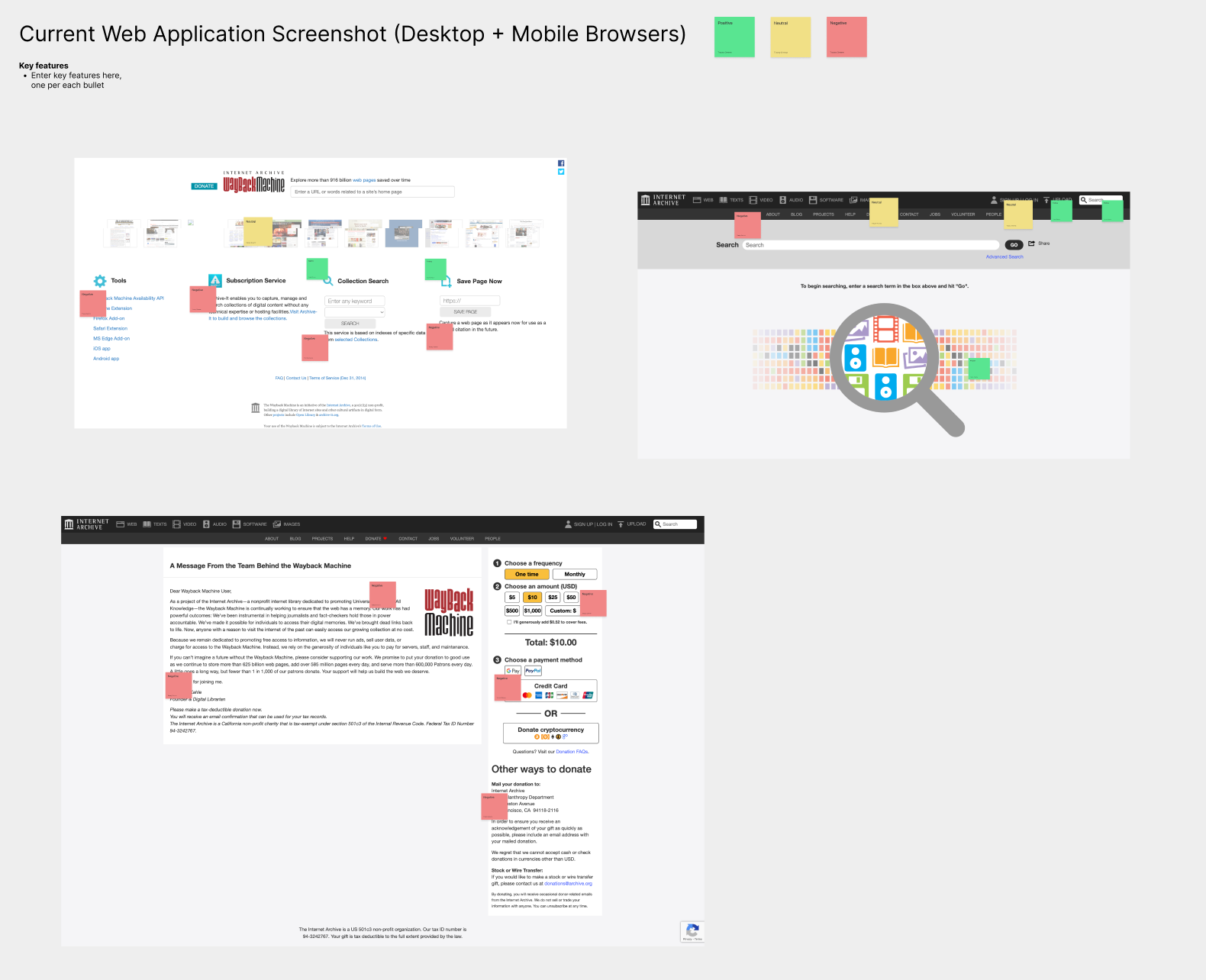
The goal of this project was to take an outdated website and completely
redesign its user interface and user experience. I chose the wayback machine
because I use it regularly and thought there were a lot of ways I could improve
the website’s usability.
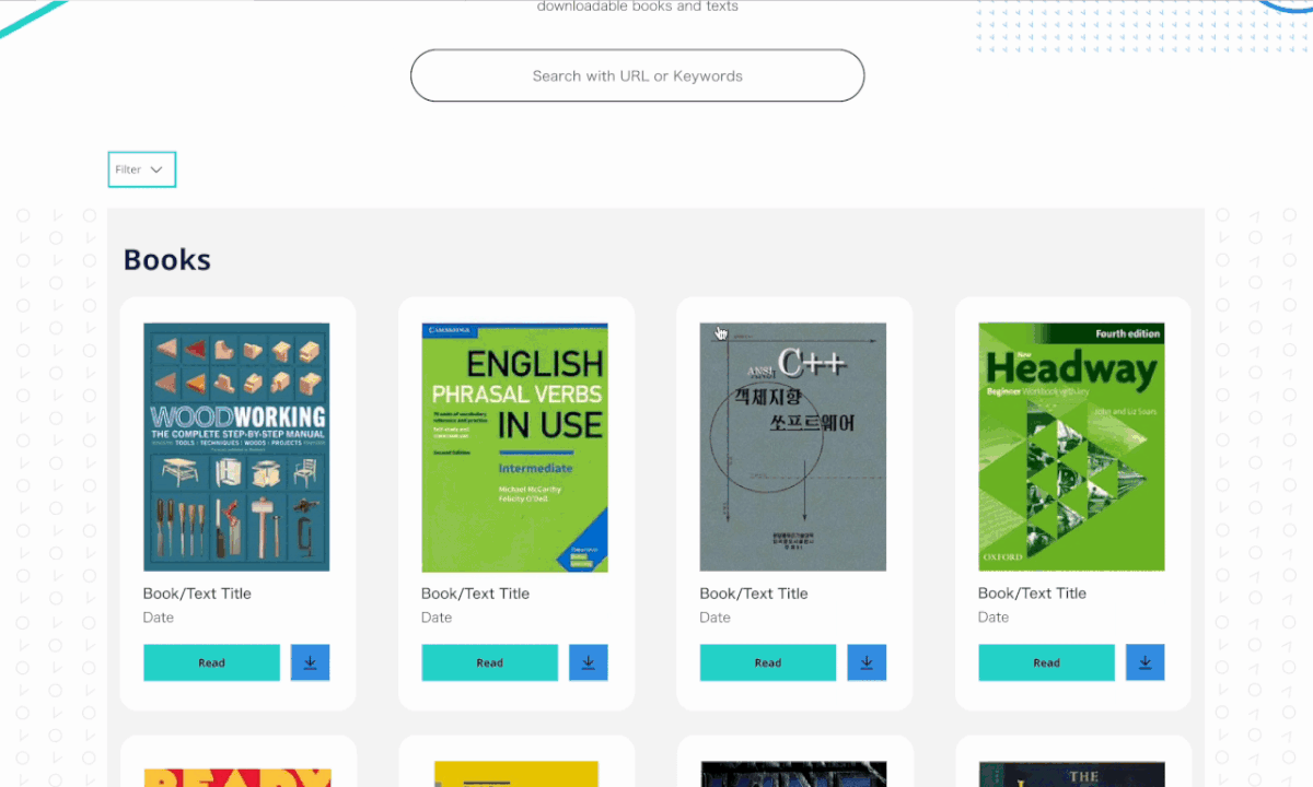
I started my research by taking a look at the original website and noting what was working and what wasn’t. I also looked at some other similar websites and did the same thing with them, allowing me to get a grasp at what UX elements worked well for an archival website like this. I then went on to create the sitemap and wireframes.
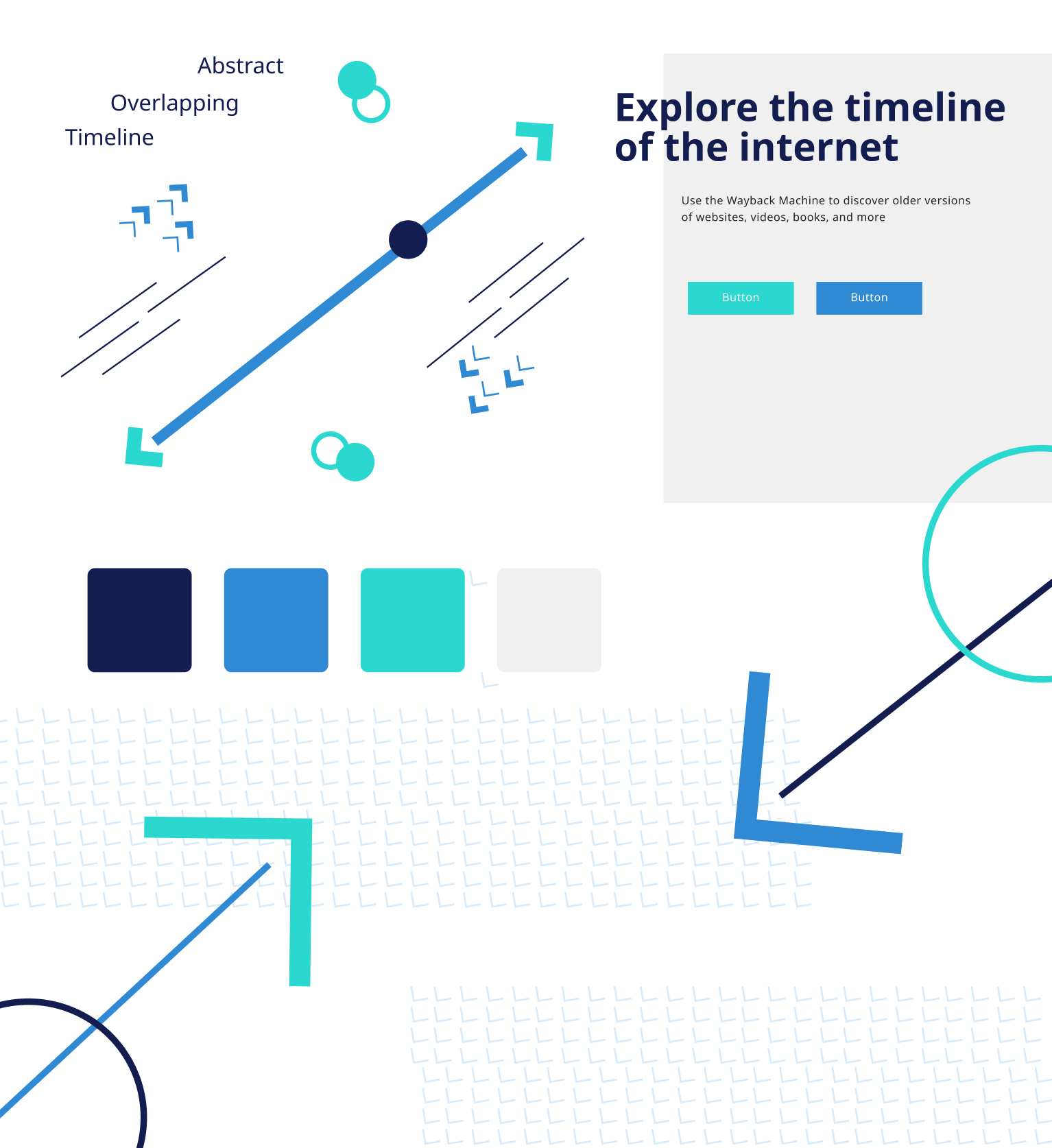
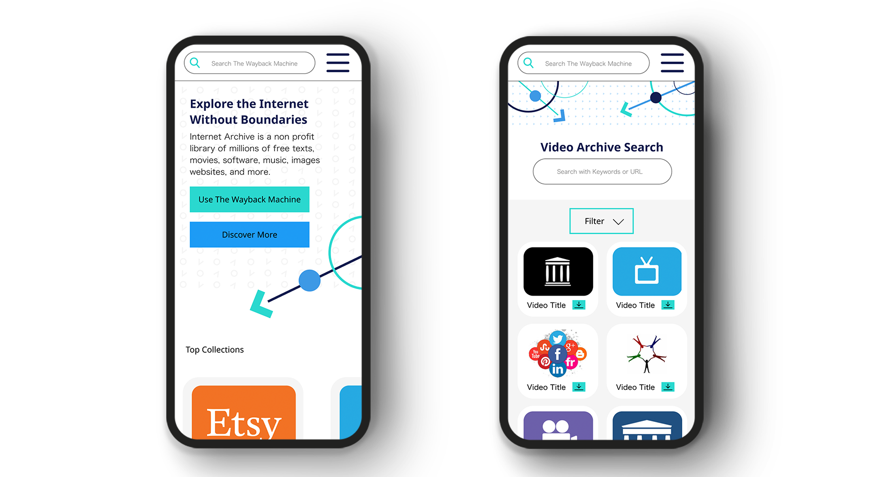
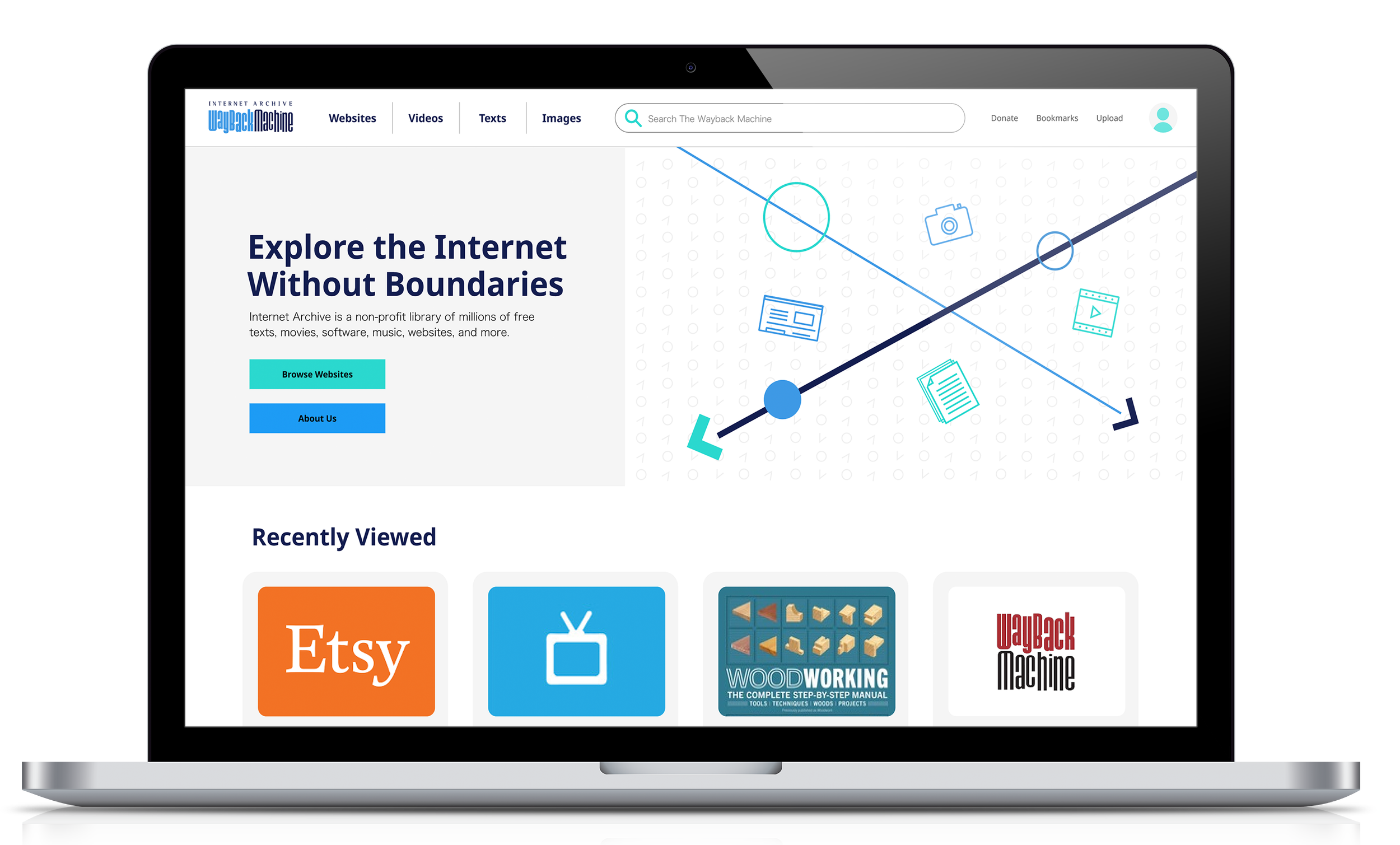
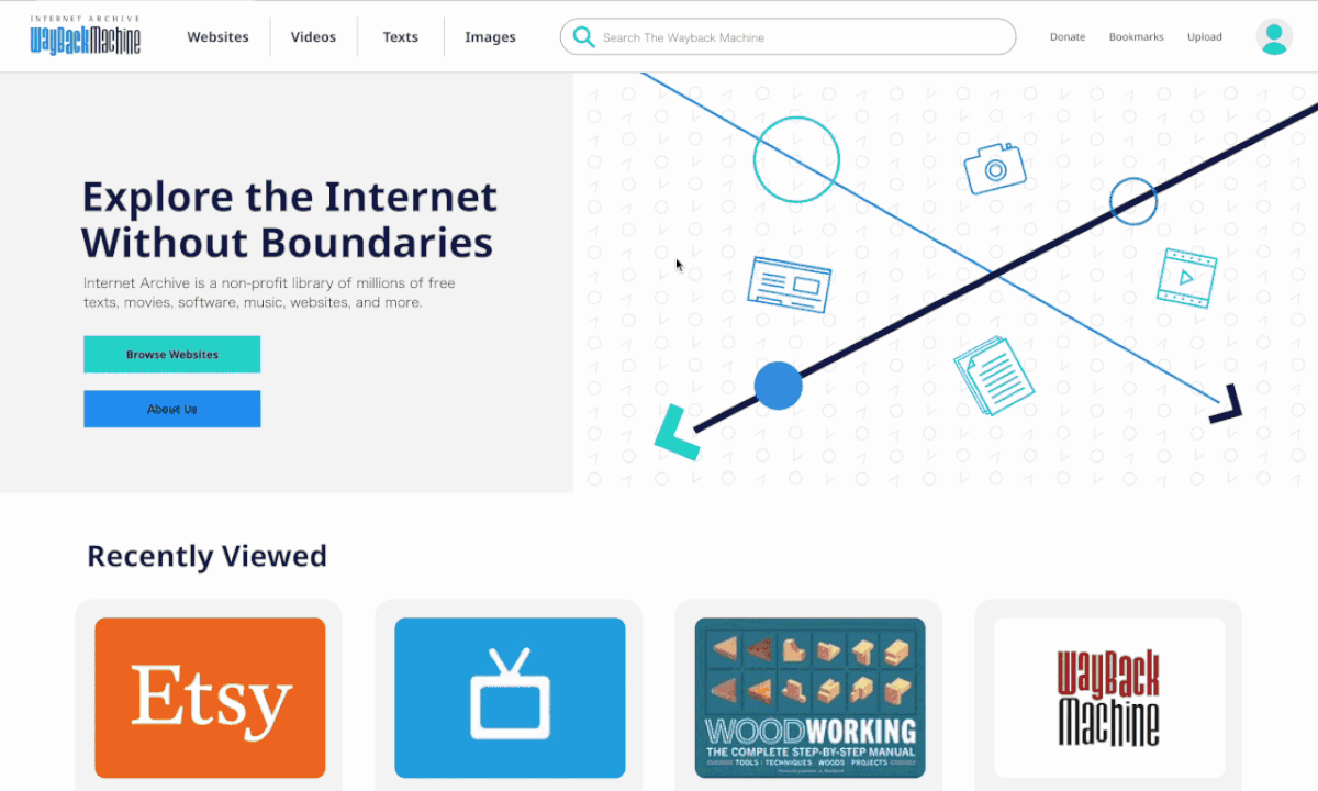
The current website is fairly outdated and doesn’t have much in terms of a developed brand identity or visual language, so I decided to make my own. I took the idea of a timeline and made a lot of the visuals based around that motif since the Wayback Machine’s main purpose is to view how websites looked at certain points in the past.
I also designed a mobile version to go alongside the desktop version. The original website is very clearly not designed with a mobile version in mind, so I thought updating that aspect of the website would be a large improvement.